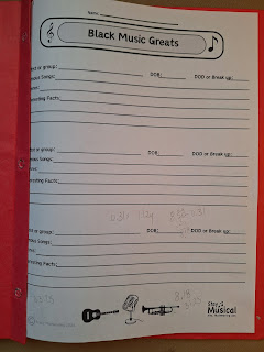
I like symmetry. Or, if that's not possible, intentional dissymmetry. If I'm knitting, or sewing, and I can't match something exactly, I prefer to choose something that looks intentionally contrasting.
When I'm designing worksheets, I quickly learned I had to account for the loss on the left edge of the facing page, if it was to be going in a duotang, or even a binder. There is nothing worse than important information being lost behind that solid edge!
Moving the page contents over towards the right a bit fixes this, yet creates another problem. It's not too visible here, but now the title block is not centered on the visible page!See what I mean? I do have to leave some outer edge margin, just to ensure it prints correctly, but do I add more to the gutter edge? And the title block! This one isn't bad because it goes all the way across, but my smaller ones look really off when centered to the page and put into a duotang.
So, do you make a page to look good out of the printer, or inserted in a duotang?
To add to this conundrum, my older students use binders. This means there technically isn't a gutter, but it's not really usable space either.
I think I have come up with a compromise. Stay tuned!


Comments
Post a Comment